Overview
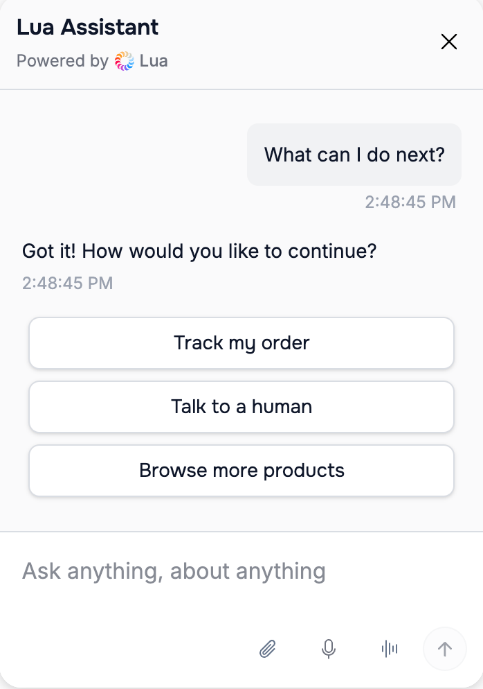
The Actions component presents clickable action buttons that users can tap to take next steps.Perfect for:
Call-to-action buttons, quick replies, navigation options after showing information
Format
Requirements
- ✅ Maximum 10 actions
- ✅ Clear, action-oriented language
- ✅ Only actions your agent can handle
- ✅ Most relevant first
Examples
After Product Listing
After Hotel Rooms
After Support Article
How to Configure
Best Practices
- Use verbs: “Book”, “View”, “Check”
- Be specific: “Add to Cart” not “Continue”
- Limit to 5-7 for best UX
- Order by importance
Next Steps
Links Component
Learn about displaying URLs